
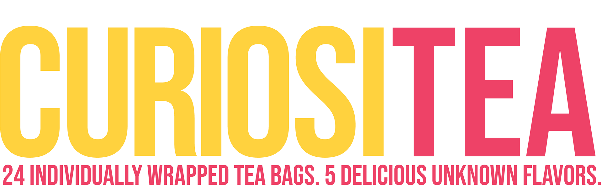

CuriosiTEA is a brand of tea that is an experience as well as a delicious beverage. You’ll never know what flavor you pick until you drink it. The idea is meant to be a fun game-like experience targeted towards young adult audiences.
design process
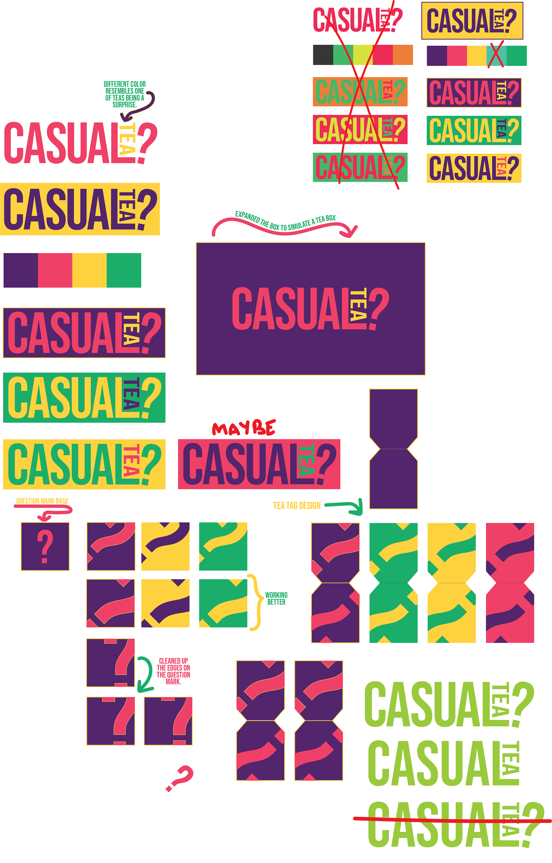
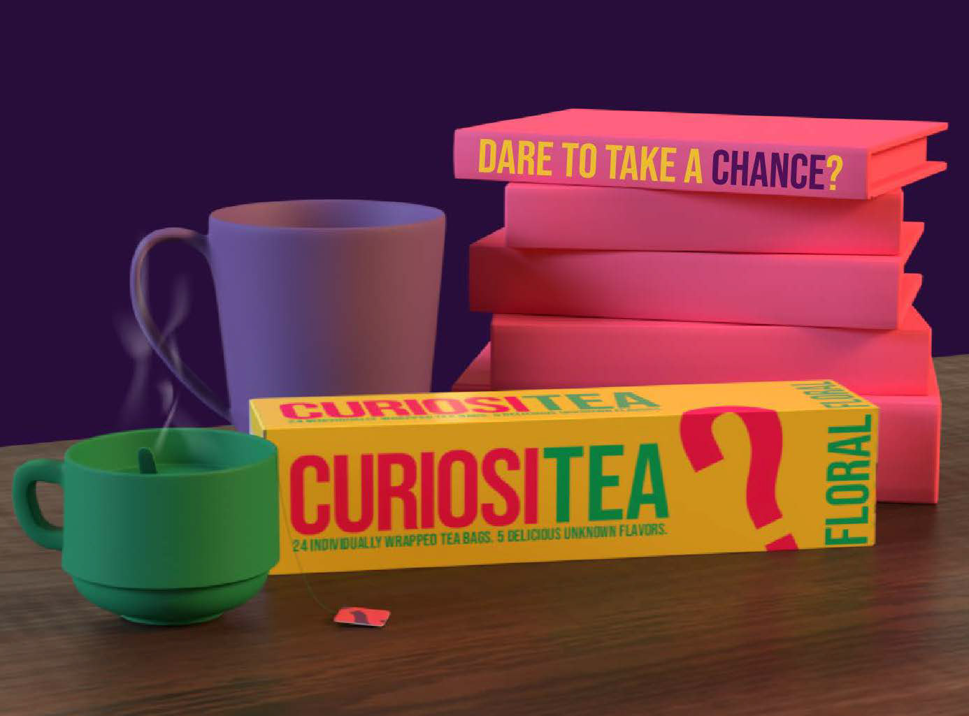
Trying to figure out the feeling and direction I wanted to go in was fairly easy. Because of the younger target audience, I wanted to go with a party-like color scheme, opting for vibrant colors and bold text that would change up the way customers think of a tea party.
There are three variations of the tea boxes. Floral, Minty, and Fruity. I paired the colors to the flavors using color associations. For example, when I think of mint, I think of green. This way, it is easier to envision the kind of flavors that are expected, which is helpful when dealing with a mystery flavor kind of situation.
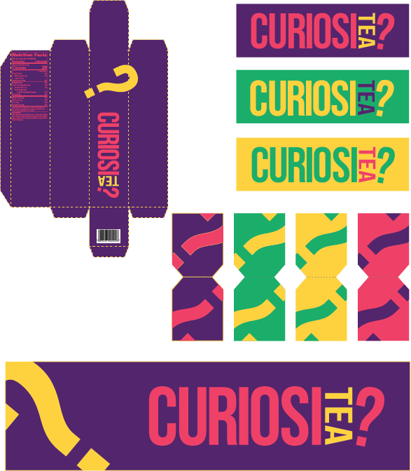
I wanted everything to be branded, even down to the teabag tags, so I created pieces for every single aspect of the experience.
box design
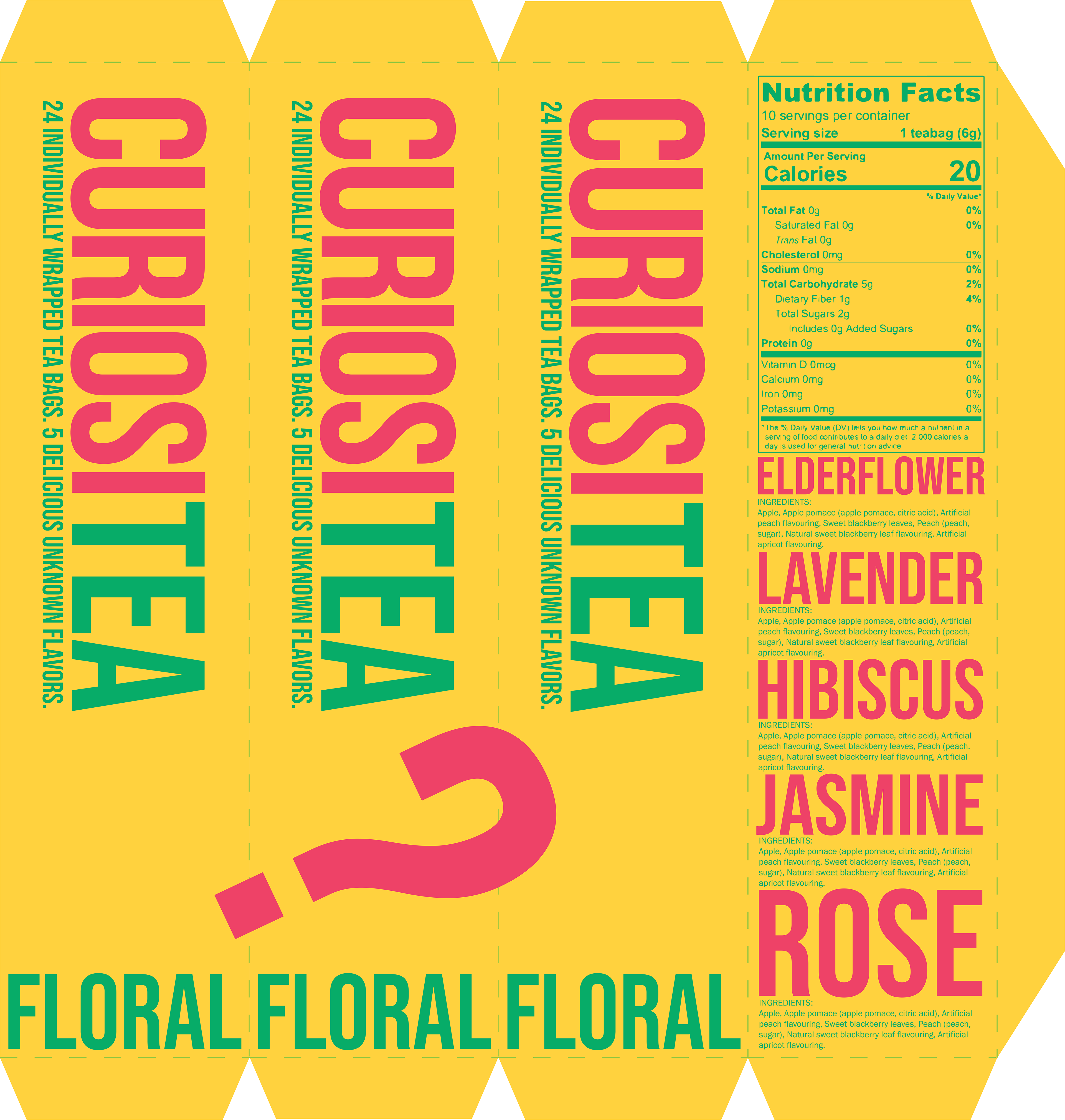
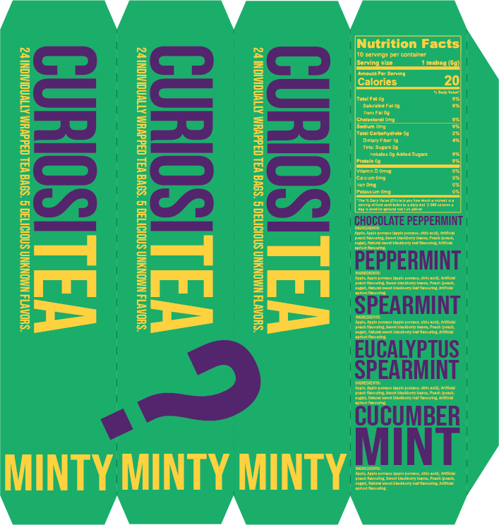
As this tea is unlike most others, it deserved a nicer box. I am a fan of designing box templates, so I went and created a sliding box design from scratch, testing it out many times to make sure that It operated smoothly. Using the edges of the box to my advantage, I added the signature question mark and stretched it to cover most of the surface, creating negative space that looks visually interesting but still resembles what it is supposed to.
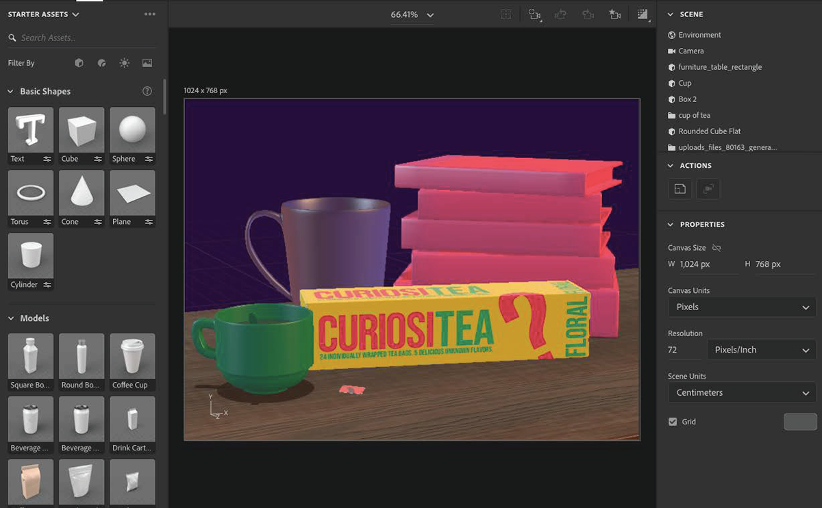
To create a mock-up, I used Adobe Dimension for the first time in my life. There was definitely a huge learning curve, but with basic modeling assets and a composition in mind, I was happy with the end result, especially after the hour of rendering!