
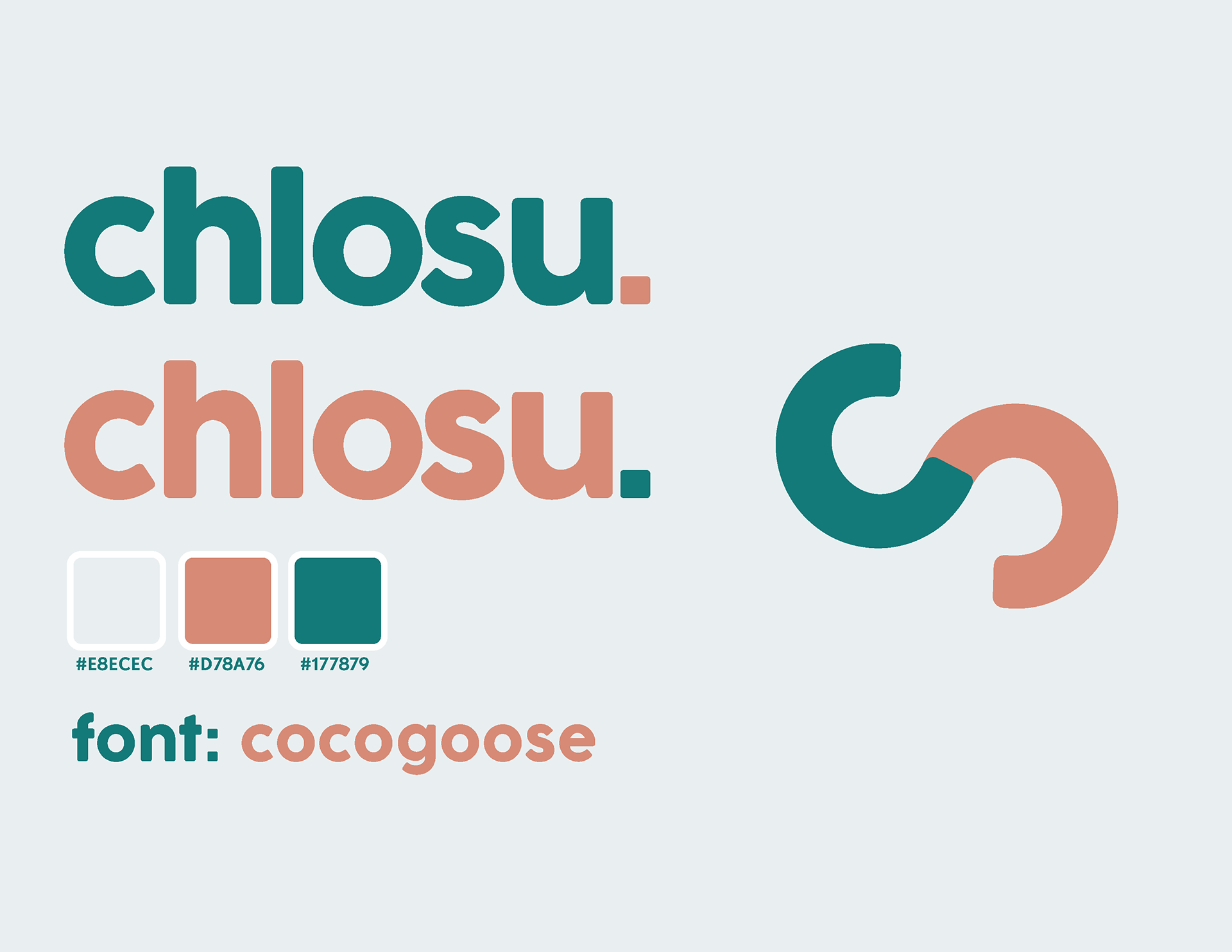
To preface, "chlosu" is the shortened version of my name, Chloe Sucevic. I chose teal as a starter color for my branding because it is one of my favorite colors and I feel that it represents me best. Alongside the teal, I chose a deep coral as the complimentary color. I was told by a professor to never use pure white unless it serves a purpose, so I chose an eggshell white as the third and final color for my branding. My personality is very playful, so I wanted to avoid harsh corners and lines when choosing shapes and fonts for this project, opting for rounded corners and curves when applicable.
business card